Megan Konar, University of Illinois at Urbana-Champaign
 |
| Where has your produce been? CoolR/Shutterstock.com |
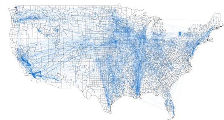
Our map is a comprehensive snapshot of all food flows between counties in the U.S. – grains, fruits and vegetables, animal feed, and processed food items.
To build the map, we brought together information from eight databases, including the Freight Analysis Framework from Oak Ridge National Laboratory, which tracks where items are shipped around the country, and Port Trade data from the U.S. Census Bureau, which shows the international ports through which goods are traded.
We also released this information in a publicly available database.

What does this map reveal?
1. Where your food comes from
Now, residents in each county can see how they are connected to all other counties in the country via food transfers. Overall, there are 9.5 million links between counties on our map.
All Americans, from urban to rural are connected through the food system. Consumers all rely on distant producers; agricultural processing plants; food storage like grain silos and grocery stores; and food transportation systems.
For example, the map shows how a shipment of corn starts at a farm in Illinois, travels to a grain elevator in Iowa before heading to a feedlot in Kansas, and then travels in animal products being sent to grocery stores in Chicago.
2. Where the food hubs are
At over 17 million tons of food, Los Angeles County received more food than any other county in 2012, our study year. It shipped out even more: 22 million tons.
California’s Fresno County and Stanislaus County are the next largest, respectively. In fact, many of the counties that shipped and received the most food were located in California. This is due to the several large urban centers, such as Los Angeles and San Francisco, as well as the productive Central Valley in California.
We also looked for the core counties – the places that are most central to the overall structure of the food supply network.
A disruption to any of these counties may have ripple effects for the food supply chain of the entire country.
We did this by looking for counties with the largest number of connections to others, as well as those that score highly in a factor called “betweenness centrality,” a measurement of the places with the largest fraction of the shortest paths.
San Bernardino County led the list, followed again by a number of other California transit hubs. Also on the list are Maricopa County, Arizona; Shelby County, Tennessee; and Harris County, Texas.
However, our estimates are for 2012, an extreme drought year in the Cornbelt. So, in another year, the network may look different. It’s possible that counties within the Cornbelt would show up as more critical in non-drought years. This is something that we hope to dig into in future work.
3. How food travels from place to place
We also looked at how much food is transported between one county and another.
Many of the largest food transport links were within California. This indicates that there is a lot of internal food movement within the state.
One of the largest links is from Niagara County to Erie County in New York. That’s due to the flow of food through an important international overland port with Canada.
Some of the other largest links were inside the counties themselves. This is because of moving food items around for manufacturing within a county – for example, milk gets off a truck at a large depot and is then shipped to a yogurt facility, then the yogurt is moved to a grocery distribution warehouse, all within the same county.
The food supply chain relies on a complex web of interconnected infrastructure. For example, a lot of grain produced throughout the Midwest is transported to the Port of New Orleans for export. This primarily occurs via the waterways of the Ohio and Mississippi Rivers.
The infrastructure along these waterways – such as locks 52 and 53 – are critical, but have not been overhauled since their construction in 1929. They represent a serious bottleneck, slowing down innumerable supply chains nationwide, including that of grain. If they were to fail entirely, then commodity transport and supply chains would be completely disrupted.
Railroads are also important for moving grain. Fresh produce, on the other hand, is often moved around the country by refrigerated truck. This is due to the need to keep fresh fruits and vegetables – relatively high value agricultural products – cool until they reach the consumer.
In future work, we hope to evaluate the specific infrastructure that is critical to the U.S. food supply chain.
[ You’re smart and curious about the world. So are The Conversation’s authors and editors. You can read us daily by subscribing to our newsletter. ]
Megan Konar, Assistant Professor of Civil and Environmental Engineering, University of Illinois at Urbana-Champaign
This article is republished from The Conversation under a Creative Commons license. Read the original article.