Bad Art You Will Be Forced To Buy...
By BETH COMERY in The Providence Daily Dose...And prominently display.
Once again this plate design contest idea is rearing its ugly head because people like Governor McKee think that anybody with a computer is now a graphic designer.
I’m sure she is an excellent veterinarian, but the sad thing is, a better design might have raised more money for her cause. I have yet to see one of these in the wild. (Go here to donate to WRARI.)
Compare and contrast this with the gorgeous, award-winning plate for the Plum Beach Lighthouse, carried out by artists and then “pulled together” by a professional graphic illustrator.
*******************************************
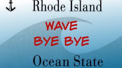
Recommended viewing: “Abstract: The Art of Design” on Netflix. This will make you realize how offensive this contest idea is. And yes, the image accompanying this post is my handiwork, and I have absolutely no training. But I’m not making anybody pay for it. Go ahead, school me. Font? Layout?
For one thing, doesn’t this man realize how strongly Rhode Islanders feel about their license plates? But whatever the state comes up with, any and all car owners will be forced to buy two of them and put them on the outside of their cars. How is the selection to be done? According to the ProJo:
The contest launched Tuesday and design submissions will be accepted through Jan. 7.
When the designs are all in, the DMV and Gov. Dan McKee’s administration will pick four or five finalists advancing to online public voting similar to the recent “I Voted” sticker contest.
So this critical, highly visible, design decision is going to be made by civil servants and politicians?! And the public can vote as many times as they want — prepare yourself for Boaty McBoatface. How long will these plates be in use? The Blue Wave plate has been with us for 25 years.
It is sad that the state that is home to one of the world’s most respected design schools, the Rhode Island School of Design, has no appreciation of the numerous graphic designers the school produces every year. Or no understanding of what they do.
Graphic design is a four year degree program at RISD. People spend tens of thousands of dollars to learn how to do this well. RISD also offers an MFA program in Graphic Design to students like Camille Chew who we wrote about when she designed the amazing ‘Year of the Rat’ stamp for the USPS. There is good design (the current blue wave plate) and there is bad design (see below).
If the submissions are all undeniably horrible I assume we can throw them out and do what we should have done in the first place: Have professionals submit proposals, and then pay for the best one . . . as judged by a panel of qualified people.
***************************************
Below is one of the ‘charity plates’ used to raise funds for a favored cause. This one is called ‘Save Wildlife‘ and it was issued to raise money for a wonderful organization, Wildlife Rehabilitators Association of Rhode Island (WRARI). It was designed by a veterinarian.
I’m sure she is an excellent veterinarian, but the sad thing is, a better design might have raised more money for her cause. I have yet to see one of these in the wild. (Go here to donate to WRARI.)
Compare and contrast this with the gorgeous, award-winning plate for the Plum Beach Lighthouse, carried out by artists and then “pulled together” by a professional graphic illustrator.
*******************************************
Recommended viewing: “Abstract: The Art of Design” on Netflix. This will make you realize how offensive this contest idea is. And yes, the image accompanying this post is my handiwork, and I have absolutely no training. But I’m not making anybody pay for it. Go ahead, school me. Font? Layout?


